
Mark Paul Cordeiro
Branding Specialist & Graphic Designer
Sonoma County • 30 Years Experience
mpcordeiro@mac.com • (707) 322-8840
When I approached this logo, I wasn’t just thinking about design — I was thinking about the role the Sonoma Art Walk plays in our community.
The Art Walk isn’t just an event. It’s people walking together. It’s conversations on the sidewalk. It’s artists being seen. It’s creativity woven into the fabric of Sonoma.
I wanted the logo to reflect that spirit — something modern and clear, but also something alive.
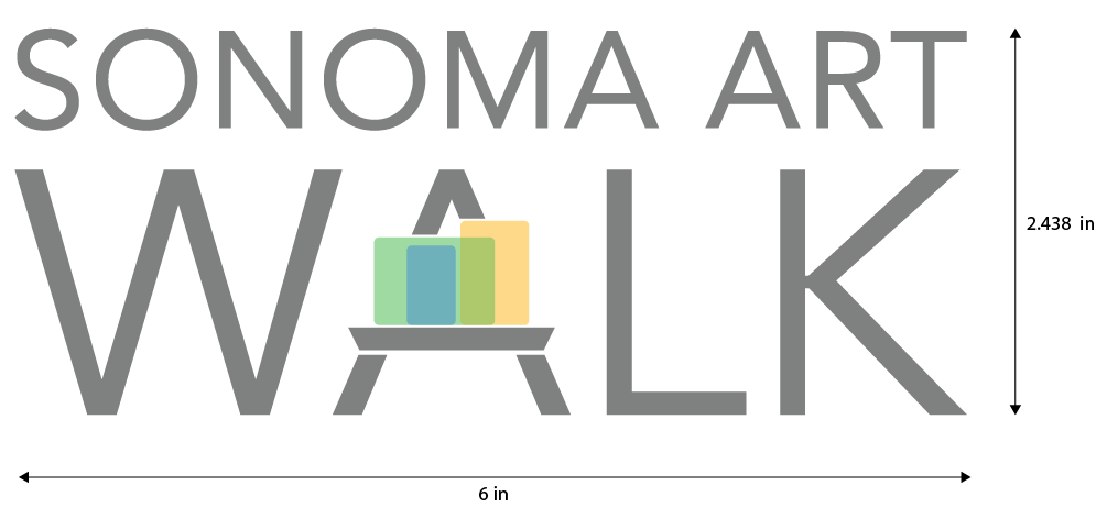
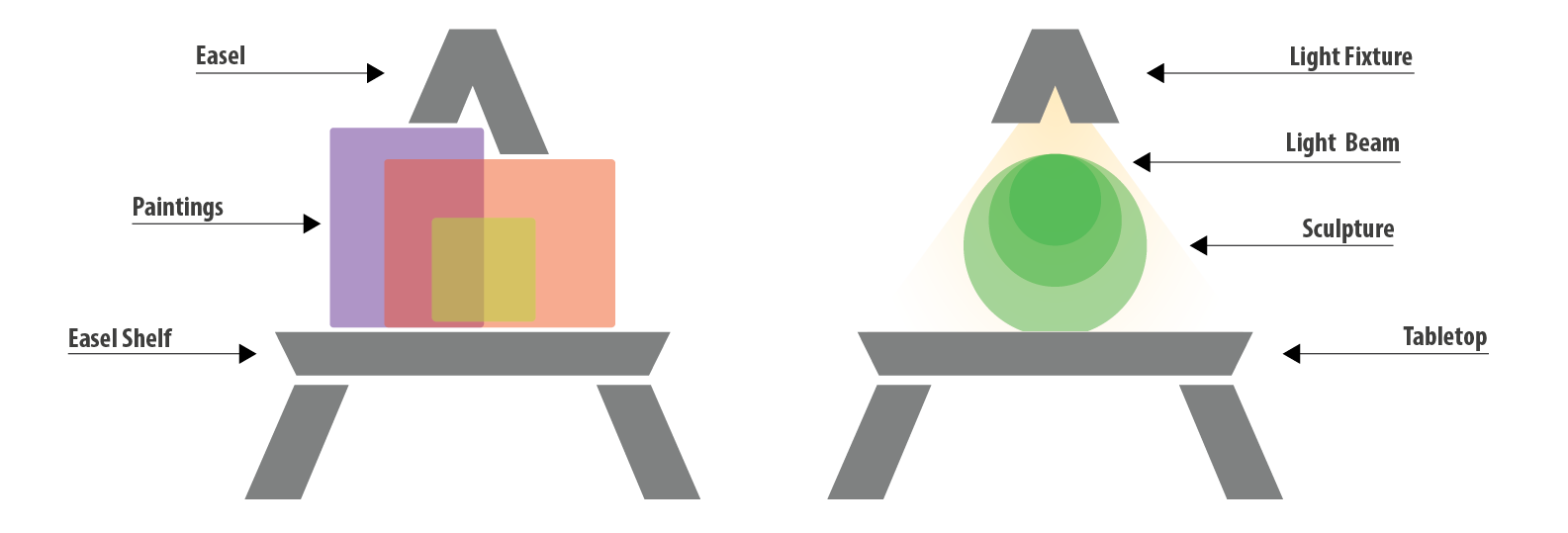
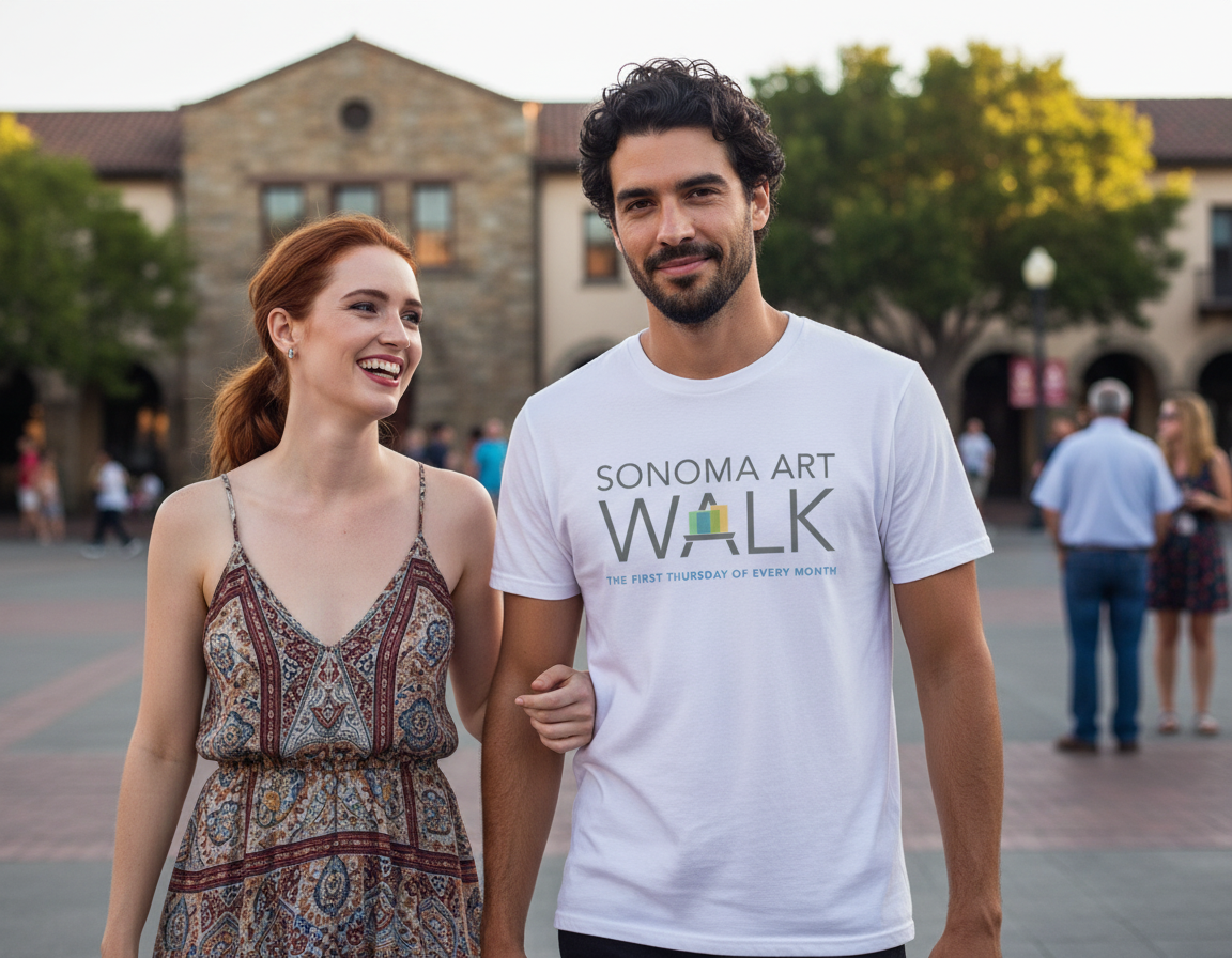
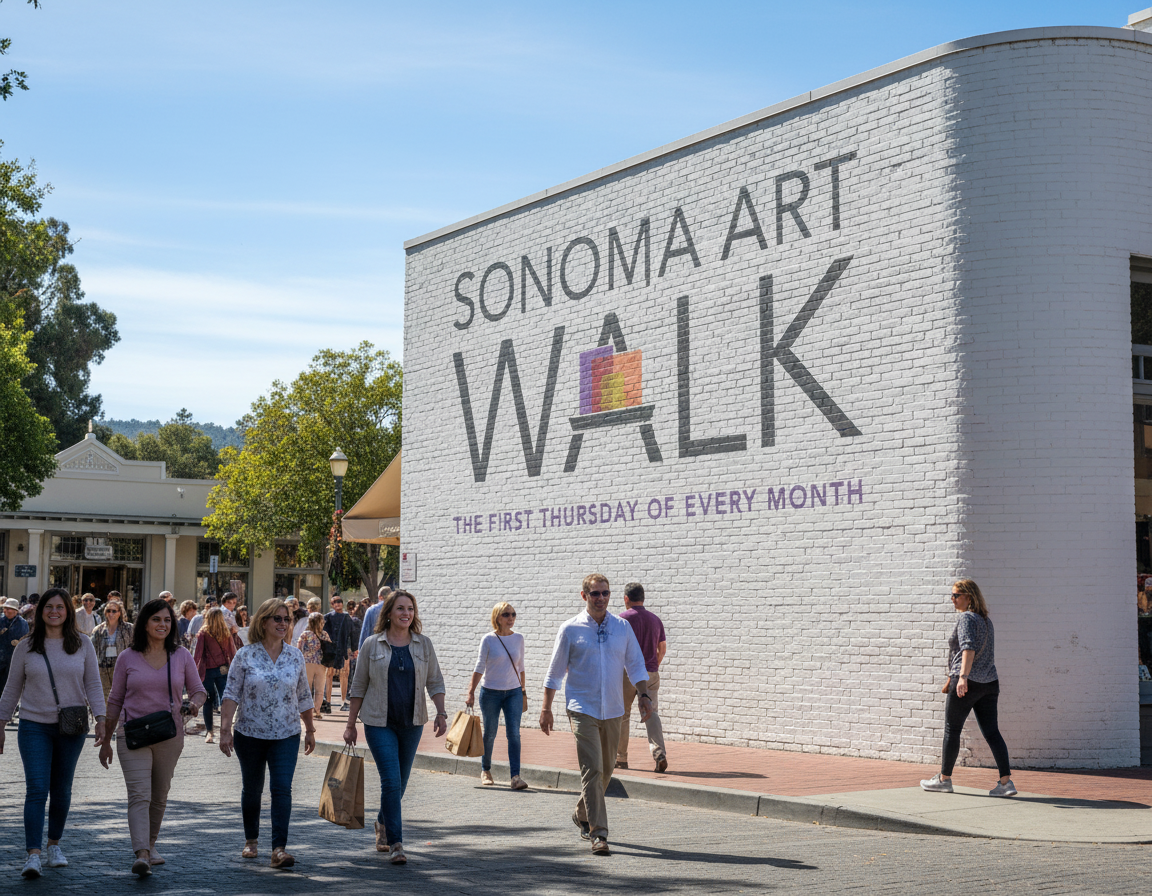
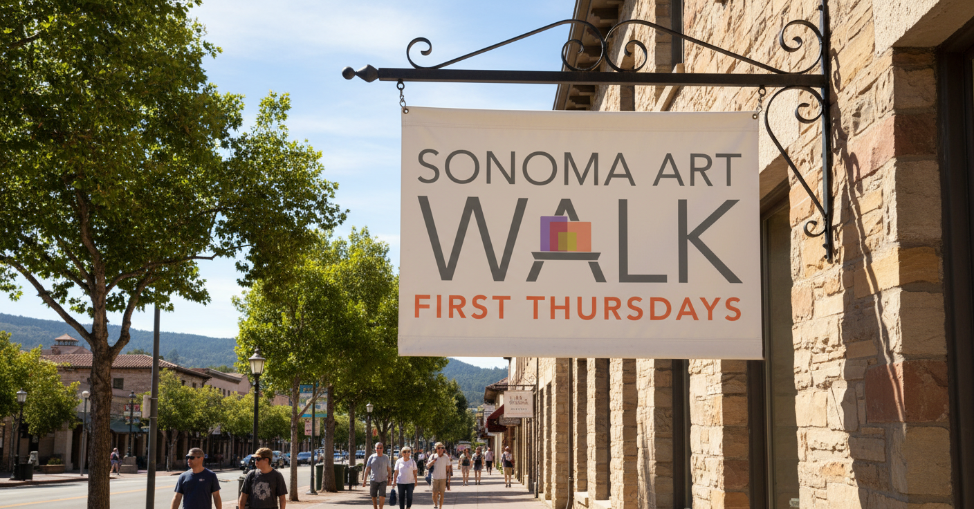
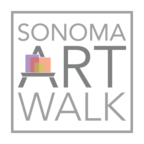
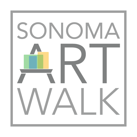
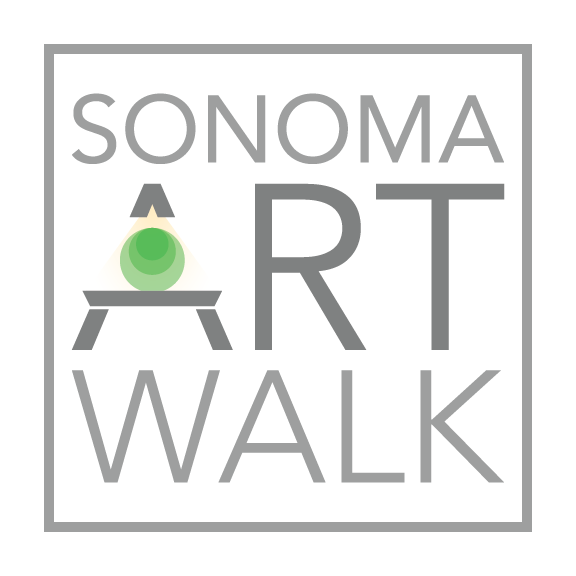
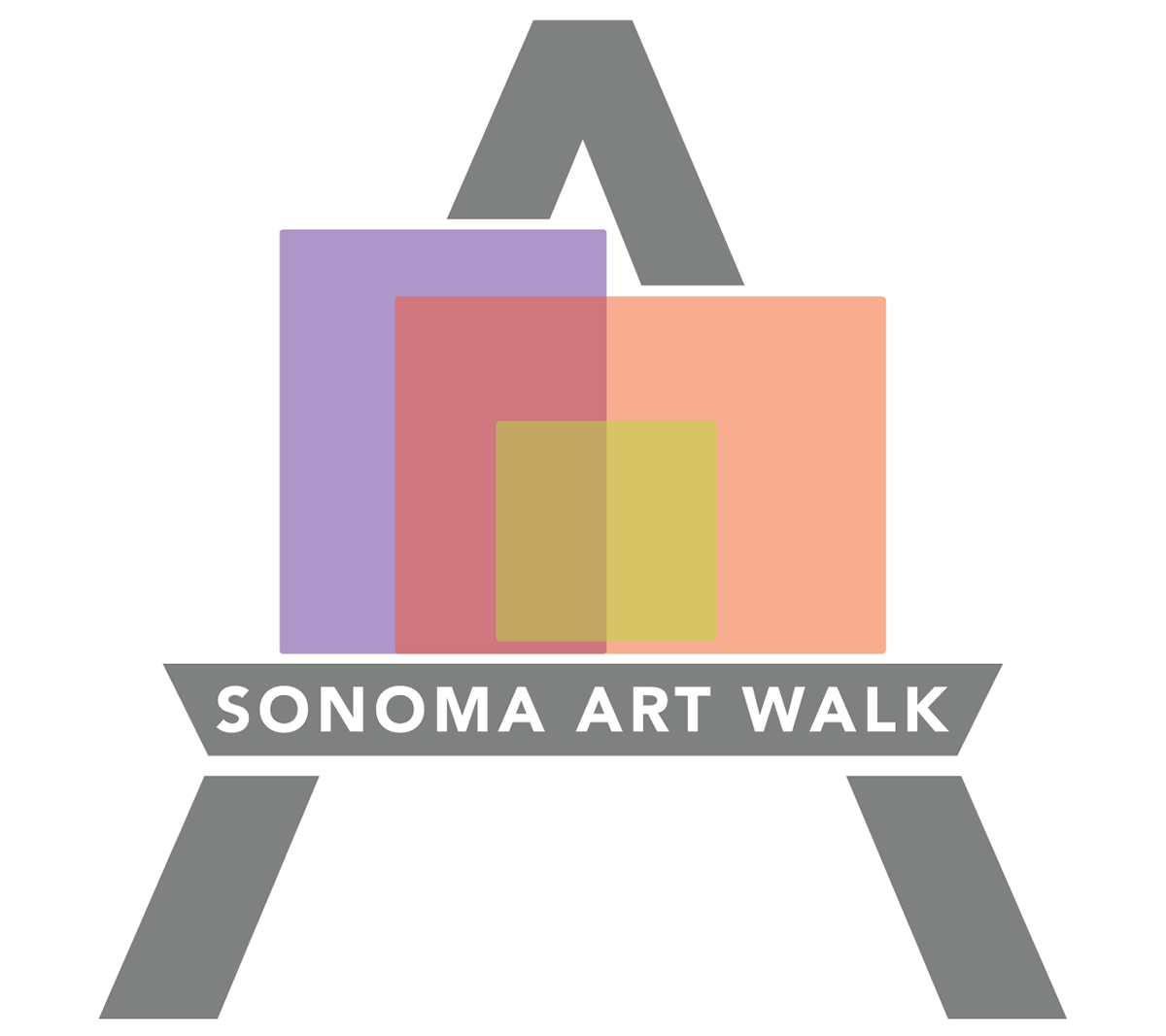
The words SONOMA ART WALK are intentionally strong and readable. Within that structure, the “A” in “WALK” becomes an easel. By modifying the crossbar and simplifying the letterform, the easel is built directly into the typography. It’s not added on — it’s part of the word itself.
That integration matters to me. It reflects how art is not separate from the walk — it’s embedded in it.
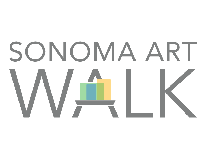
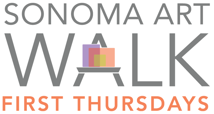
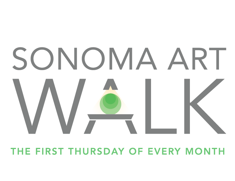
What excites me most is the flexibility. The easel creates space, if desired, for art to change year after year. The canvas can hold bold color, abstract form, photography, sculpture — whatever the focus may be. The structure remains consistent, but the art evolves.
That feels aligned with the Art Walk itself — grounded in community, but always growing.
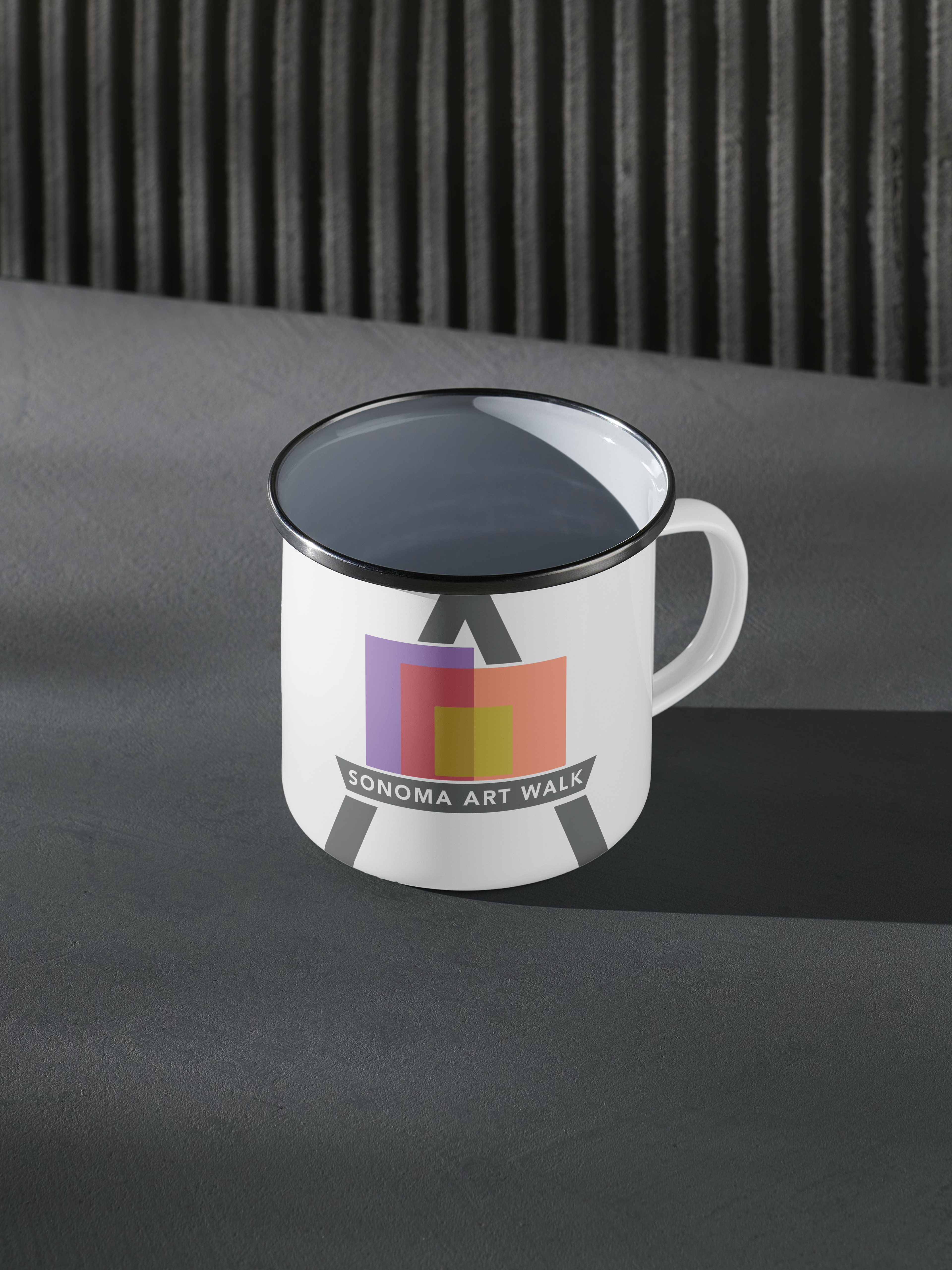
The logo can stack, align horizontally, shift color, adapt to banners, social media, signage, and merchandise without losing its integrity. It’s meant to be a living identity — not something fixed or rigid.
More than anything, I care about the success of the Sonoma Art Walk. I believe in what it brings to this community.
If my design is selected, I would be more than happy to collaborate with the committee to refine and evolve the logo in any way that best serves the organization. My goal is not just to submit a design, but to contribute something meaningful and lasting.

MAIN (BASE) LOGO & MEASUREMENTS:
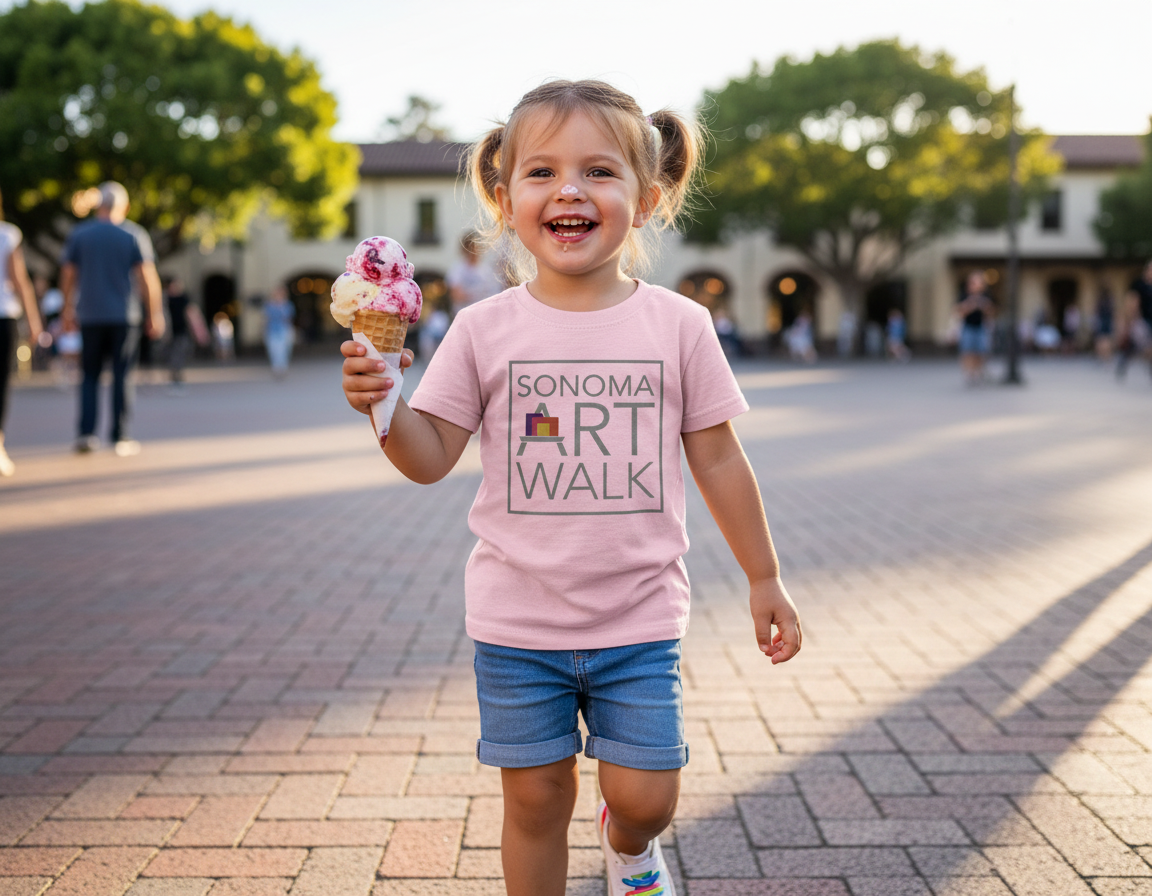
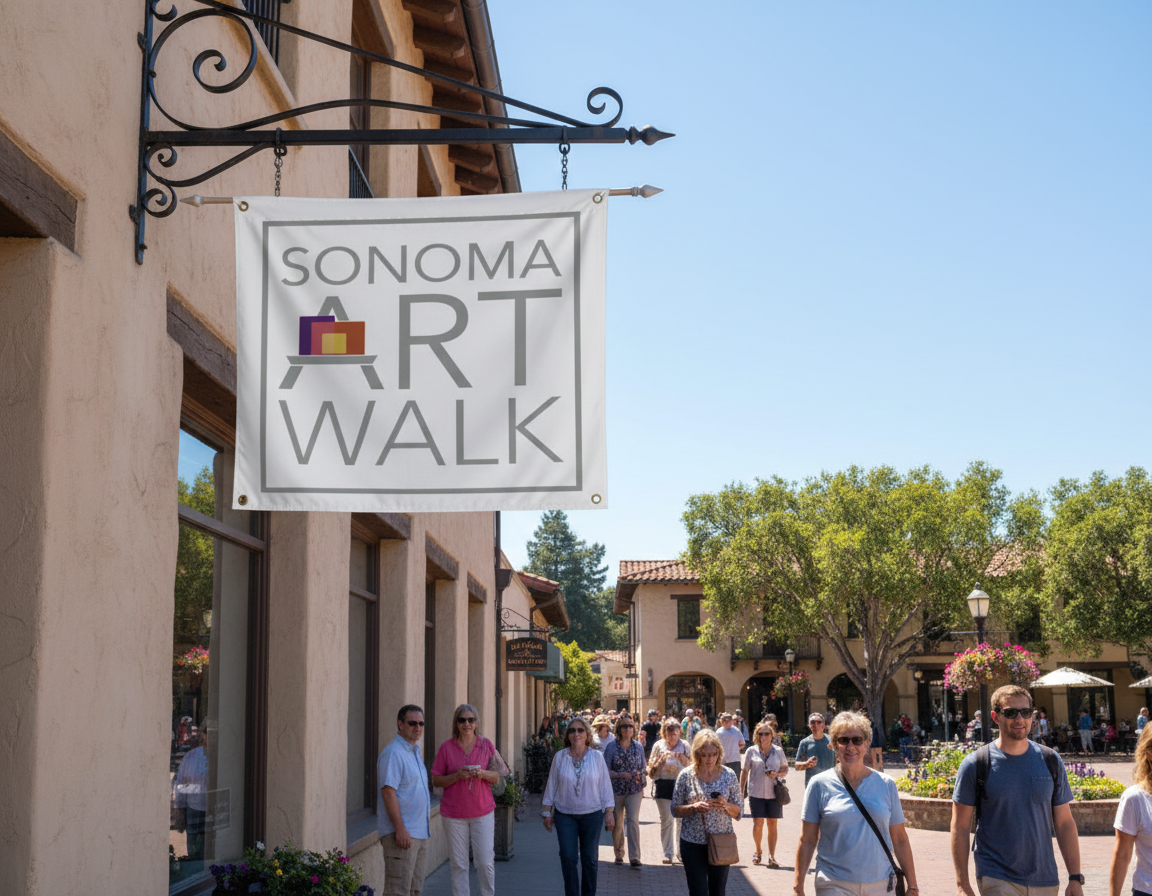
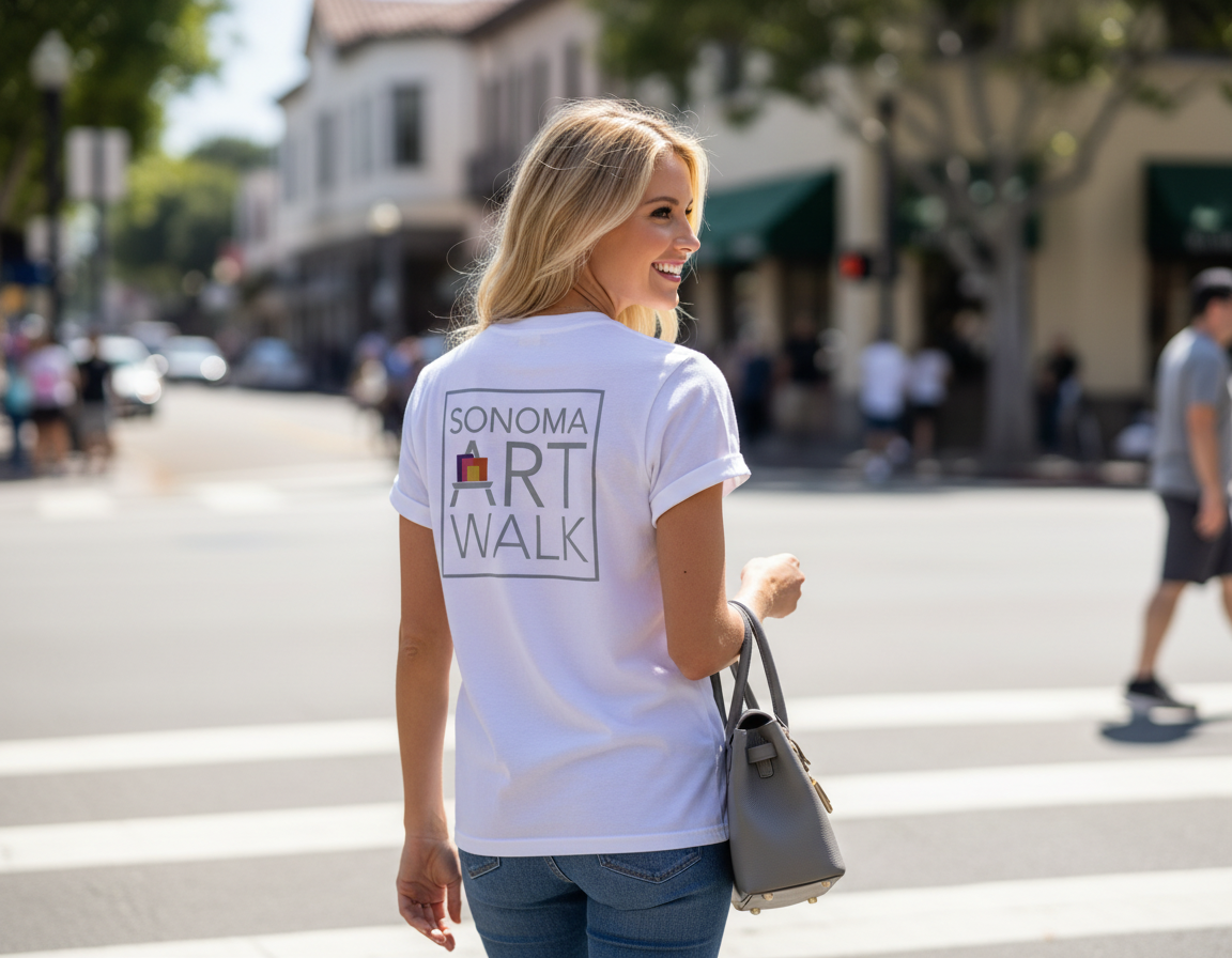
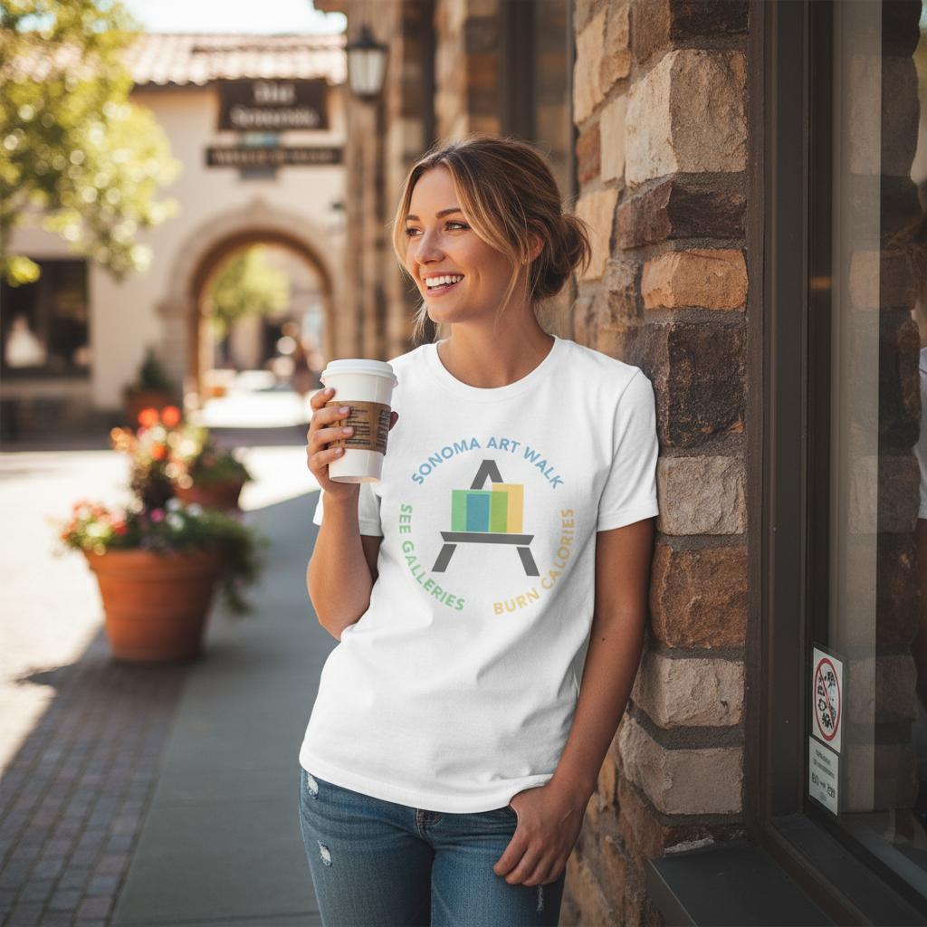
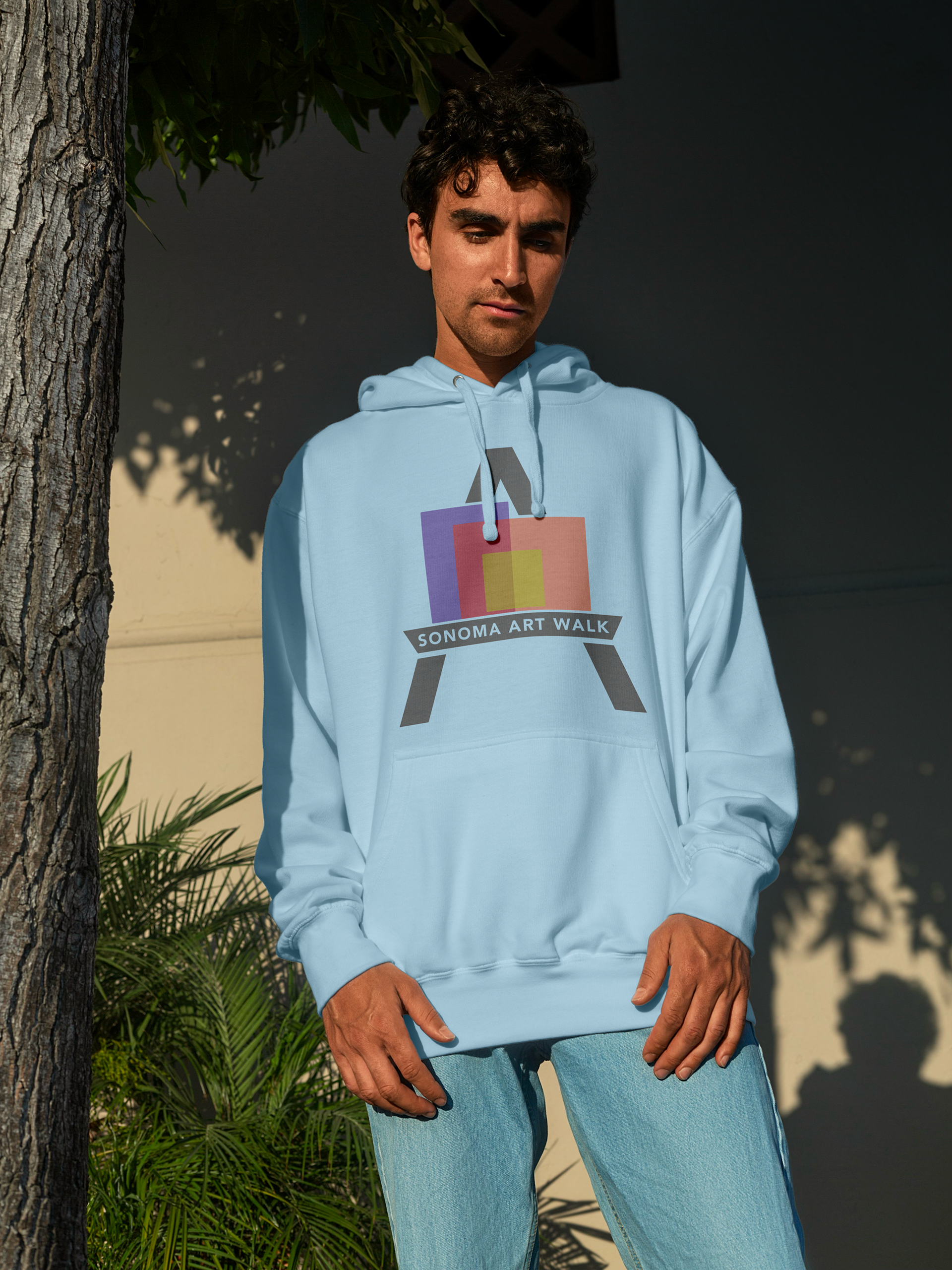
Below is an alternate design where Sonoma Art Walk is stacked in a square boarder. A usable alternate to the original design that keeps the original feel and flow. Great for banners, t-shirts and merchandise.

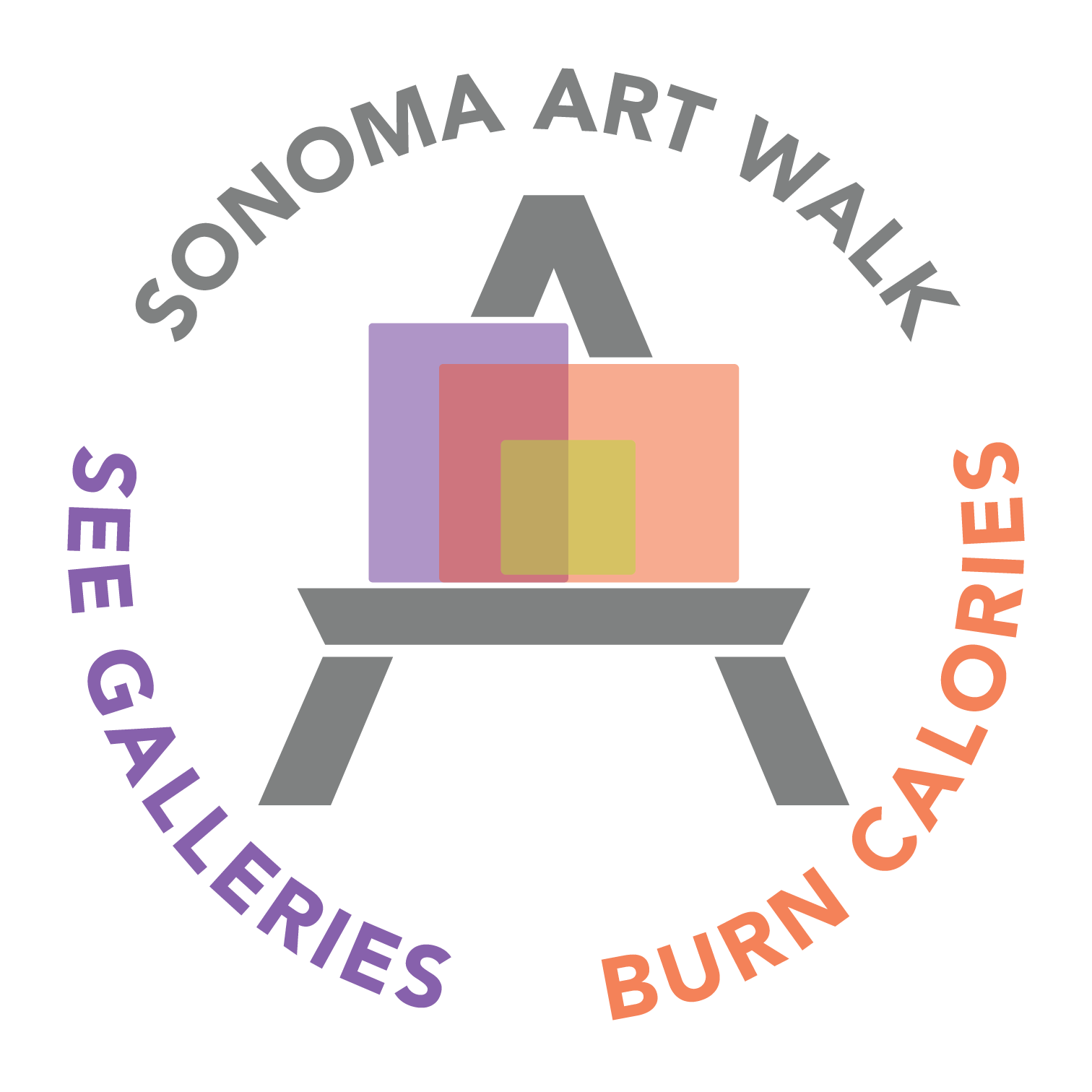
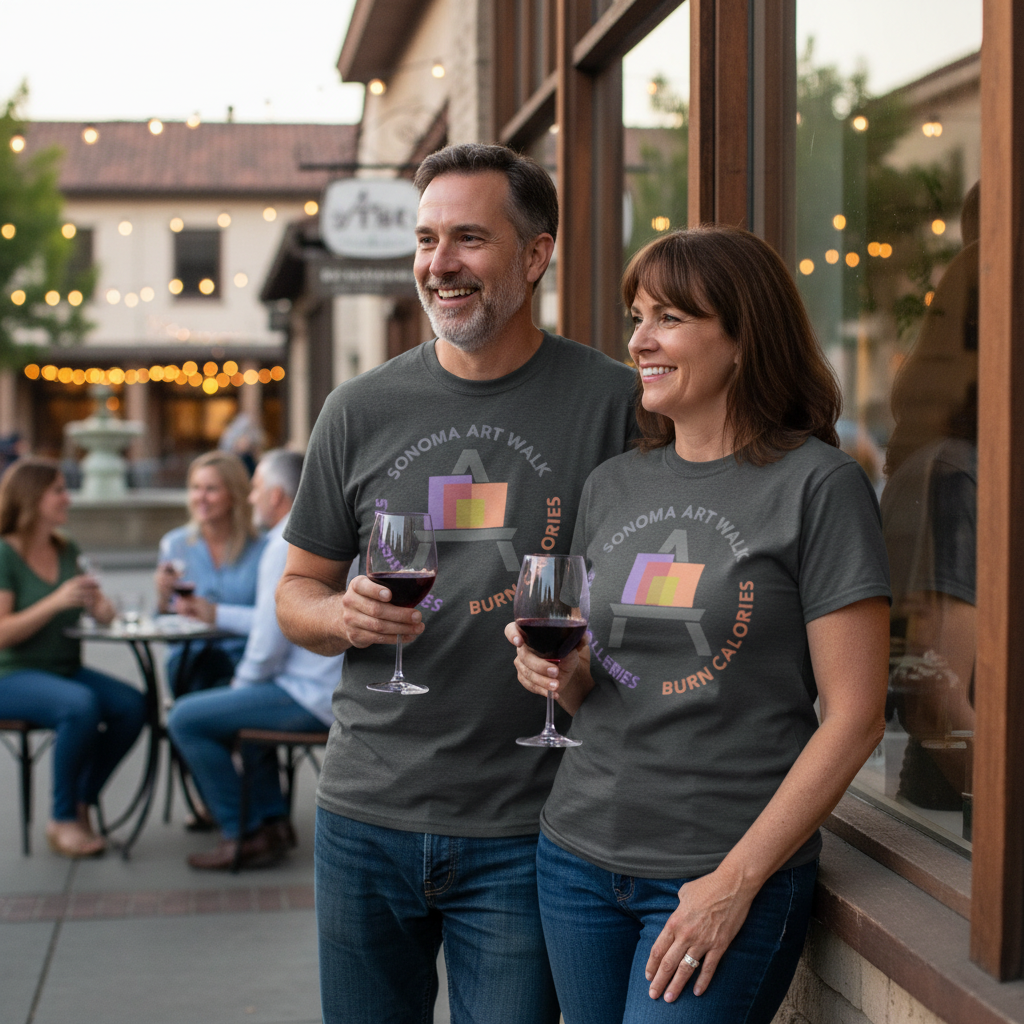
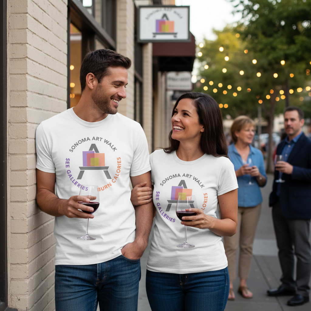
Below is another alternate design where the Sonoma Art Walk text is paired with the tagline, "See Galleries. Burn Calories." The "A" in the art text is singled out and enlarged in the center. The idea is that there really is only one logo, but it is able to be mixed and matched in many different ways to keep things fresh and new but always familiar.
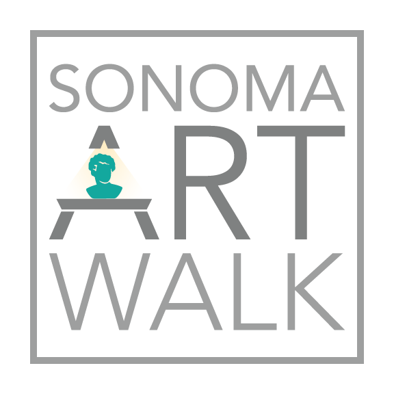
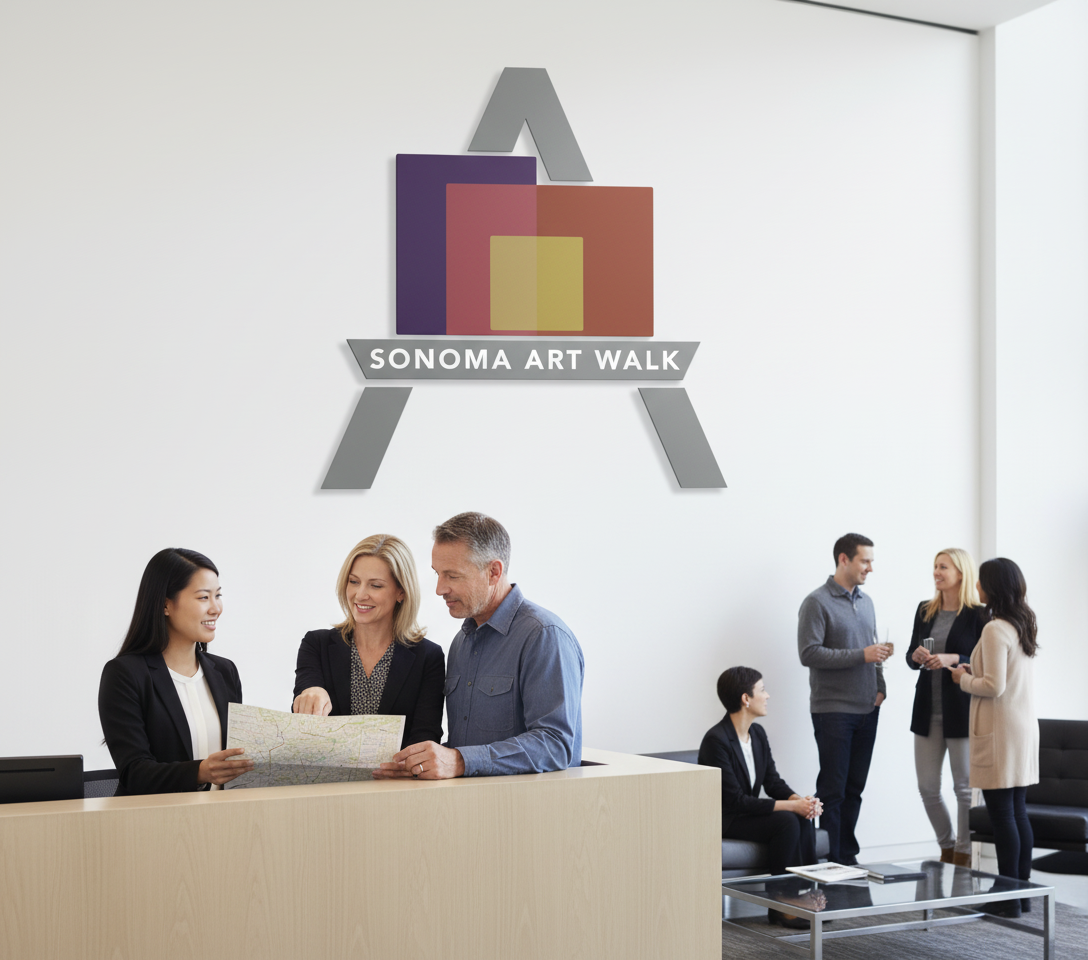
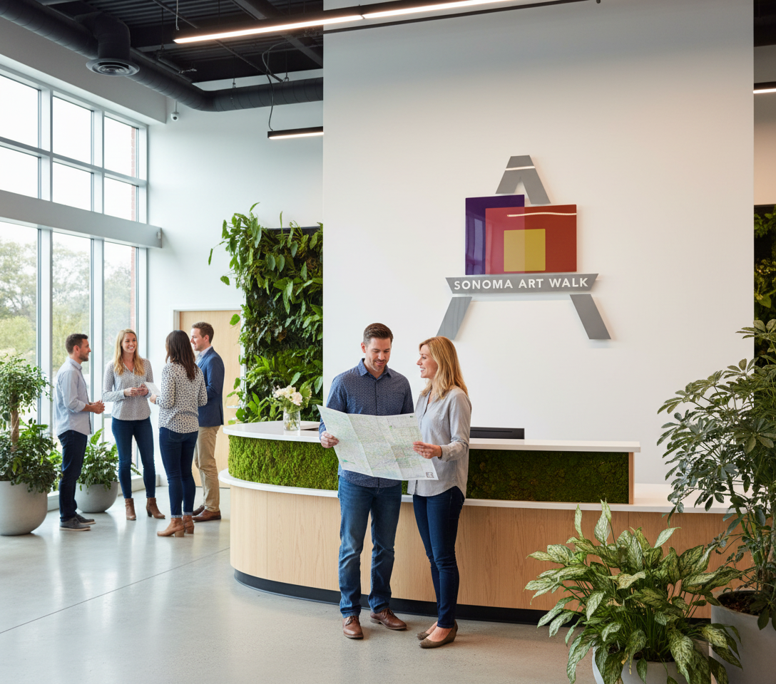
Below is an example of a corporate logo design. It's extremely simplified. An example of this version would be for the back of a reception area, but it could also be used as another version of the Sonoma Art Walk logo.

sonomaartwalk.design
Logo design and concepts by Mark Paul Cordeiro, 2026